 Hopefully you will have noticed that I have a new banner to my blog. Yeh! Over the last year, my product range has expanded. I have gone from just selling my uniquely designed finished knitting accessories to selling the knitting patterns themselves. Then 6 months ago I started collaborating with my local yarn shop and had the opportunity to sell knitting needles & tools. The best move I made though was to put all those qualities together in the form of 'Knit Kits' just before last Christmas. It was the best thing for 'The Feminine Touch Designs'.
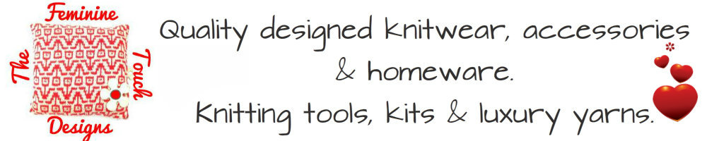
My new banner incorporates my new logo, one of my unique designs, knitted in the most feminine colour there is, with a pretty little feminine flower drawn on. It's a design I played with over a number of weeks and one I'm totally happy with for now. The words on my banner encapsulate what's available in my on-line shops today. Totally different to what is was 12 months ago.
It took me a while to realise that I needed to re-look at my branding , rehash the words I use to describe what I do / sell on my web site and on-line stores.
I had wanted to sell some luxury yarns (so soft and luscious. gorgeous to work with) in my local yarn shop and needed some product tags to attach to the skeins.
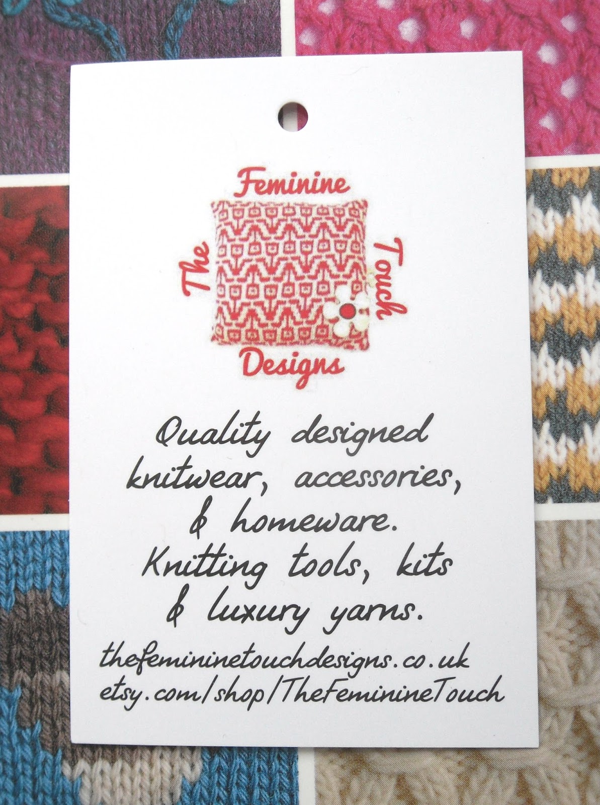
I knew then, that if I created these product tags then basically I had to change my whole branding, my web site and blog, all my social media places, my packaging and promotional material. Everything now needed to gel together. Everything needed to communicate my brand. This was important to my business as a whole. Would show my potential customers that I was serious about my business and what I was offering.
The time was right too and I was just about to launch some new knitting kits with the luxury yarns.
So this week I launched some of the new kits with lovely pretty packaging which shows off the kits really well. It took me a little brainstorming to determine what I wanted the packaging to look like and even longer to find it, lol. I needed the boxes to be white, clean, sharp and sturdy to match the product tags. I wanted a clear cut out front, ideally flower shaped (which I found) to match the flower in my logo and I wanted pretty red and white ribbon.
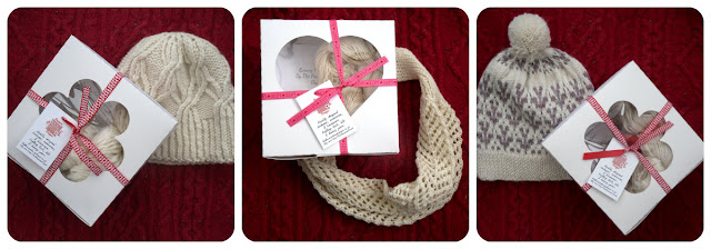
I surprised myself by photographing the kits on a red cable background, a total change from the normal white background that I normally use, but I thought it was more consistent with my new brand now.
At the moment I'm feeling so proud of my new look x
Do you have a consistent brand to your business ?
How did you go about creating it?
What does your brand tell potential customers about your business?
How does it make you feel about your business?
Let me know in the comments below. Would love to know.

No comments:
Post a Comment